
Phlavours Phor You ECommerce Site
UX/UI | Case Study/Mobile Site Design Sprint | May-June 2025 | Prototype
Welcome to Phlavours, Phor You

Phlavours Phor You is a budding Instagram business that provides local, clean, organic products that is set to restore the confidence of the user in an affordable way. This brand, set out of the Portland area is looking for ways to reach a wider audience and update their aesthetics surrounding the brand of how it is presented.
Myself along with three other teammates set out to see what we could do to help.
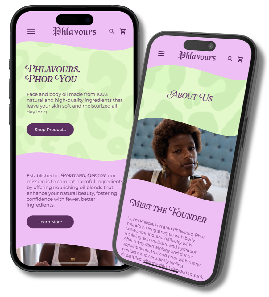
Meet Philicia

The Founder of Phlavours Phor You
Philicia created the brand out of personal frustration. After struggling to find affordable, gentle skincare that truly worked for her sensitive skin, she decided to make something better herself.
Her mission is simple but powerful:
To simplify skincare with all-natural, organic products.
Instead of overwhelming routines or chemical-heavy formulas, her approach is about clean, nourishing ingredients that support natural beauty.
Every product is designed to restore confidence and make skincare feel like self-care—without the stress, the guesswork, or the irritation.
Philica’s ideas and requirements for the site were using themes of Animal Print and usage of Old English in the logo to stick with her original branding. She was integral and hands on with helping the concepts of the site.
Philicia’s Problem
Philicia is clearly passionate and creative, but Instagram only goes so far.
As a platform, it limits product discovery, content structure, and the overall user experience—especially for shoppers looking for more details or wanting to make confident purchases.
Our Three Goals to Help
Enhancing the brand’s visual identity and voice.
Simplifying the shopping experience, and
Strengthening customer connection beyond the feed
My Contributions
User Research and Interviews: I helped to create Interview questions based off of Skin care routines and how skin care can effect confidence in a person and how what their day to day routine may be. Using this I interviewed several people with keen interests in skin care and gathered data based off of what they said.
Developing the User Journey and User Story: Using the information gathered from the interviews, I created a user journey that would set the basis for the remainder of the design process. How the User got from point A to point B was very crucial in deciding the direction of the site as a whole.
Aesthetic/Design and Wireframing: I came up with the pallet for the site through research surrounding skin care brands and colors that suited Philicia’s overall themes and idea’s that surrounded her brand. Using this furthered the site’s aesthetic and was intertwined with the website in the Hi-Fidelity wireframing later on.
Introducing Samantha Jones
Age: 32 | Occupation: Licensed Esthetician | Location: Portland, OR
Based off of several User Interviews we developed this User persona.
Samantha values natural ingredients in her skincare products
Samantha values environmental conscientiousness.
Samantha values results and trustworthiness in advertising and branding.
Samantha’s Thoughts:


Samantha’s Journey
After reading an article on her daily news app, Samantha is shocked to learn that her current skincare brand has been testing on animals.
Feeling betrayed, she decides it's time to find something new - an ethical and local brand that aligns with her values.
While scrolling through Instagram, she discovers Phlavours Phor You on her "For You" page. Impressed with the site, she scrolls through and makes a purchase.
Our Process
Through the research and information gathered through User interviews and a development of the User Journey we created various Low-Fidelity prototypes that reflected the direction that we were headed in for a final product. Since the user’s journey revolved around the mobile side of things, with the usage of Instagram we decided to focus on that.


From there we focused on developing a Brand Voice, including various palettes that would become our final decision on colors and fonts for the site that would stick through the entirety of the process. This lead into applying these to the Prototypes and setting the stage for A/B testing to further the public opinion on where to go next.
With these we created Hi-Fidelity wireframes that matched the results that we obtained through research and testing. These reflected the branding and ideation that came with creating the palette and the development of fonts.

The End Result
In the end, we created a product that fulfilled both Samantha’s and Philicia’s needs. To close the her story, Samantha finds more than just a skincare product. She discovers a brand that reflects her values: local, transparent, natural, and thoughtfully designed—with smooth colors, wavy lines, and an authentic story that makes her feel genuinely connected.
Results
During our usability testing, we observed how users like Samantha navigated through the homepage, about page, and product pages.
Users found the site’s layout straightforward and its content informative.
A recurring comment that we received was how the wavy lines and color-blocked sections contributed significantly to the site’s visual appeal and clarity between the different sections.
When presented to Samantha, she was delighted with the results. She had a few comments to say:

Moving forward we would work on developing this into an actual site for Philicia, passing it onto developers that would be able to produce a site that matches what we have created up to this point. I would additionally add more in depth pages that explain the different products in detail, and more interactive elements that would cause the site to stand out and stay with the modern trends.